Football legend Eddie Betts launches Eddie Betts Foundation with branding via TABOO

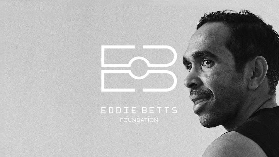
Independent agency TABOO has proudly announced its collaboration with football legend and Indigenous activist Eddie Betts, with the launch of the Eddie Betts Foundation. The foundation – created to improve opportunities and outcomes for Indigenous youth in sport and education – was created by Eddie and Anna Betts, with branding by TABOO.
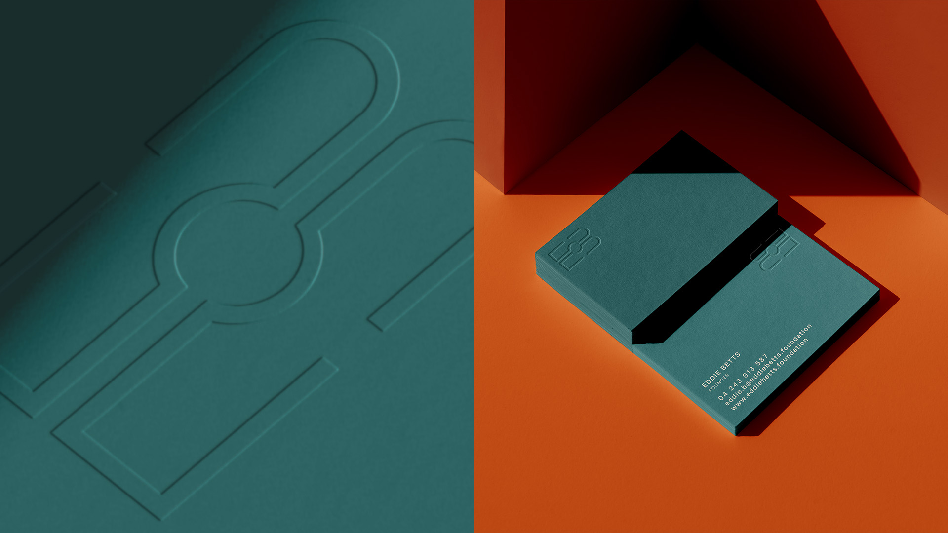
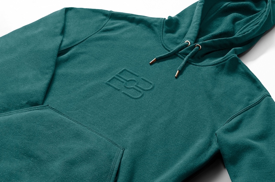
Working closely with Eddie and Anna, TABOO took a considered approach in crafting the brand identity, website design and merchandise to capture the spirit, resilience, and ambition of Eddie Betts. The logo artfully incorporates Betts’ initials with the Aboriginal flag and the stitches of the AFL ball.
Says Eddie Betts of the collaboration: “I want to express my heartfelt appreciation to the TABOO agency for their unwavering support and dedication in bringing my vision to life. They went above and beyond to ensure that every detail of the branding was perfect, reflecting the essence and purpose of the Eddie Betts Foundation. Their collaboration has undoubtedly set a new standard in consultative and culturally-safe development, and I am honoured to have had the opportunity to work with such an outstanding team.”

Says Dane Falkström who led the design at TABOO: “Working on the Eddie Betts Foundation was very special for me – and I’m very grateful to have contributed in a small way. This project was considered and very thoughtful in its approach, which I believe has led to an identity that is up for the journey. It holds many layers of meaning.”
The impact of the initiative has so far been significant, attracting the attention of various media outlets and generating widespread support on Betts’ social media channels.
Says James Mackinnon, MD, TABOO: “We are honoured to collaborate with Eddie and Anna on this project. Our team was really inspired by Eddie’s remarkable journey and his commitment to creating a better future for Indigenous children and athletes. We think the brand work conveys Eddie and Anna’s mission and we’re committed to helping support them as a force for generational change.”


6 Comments
You stole defeat from the jaws of victory – the E should have been rounded like the B. It’s close to lovely design.
Disagree. You should never try to have too many tricks in a logo. A rounded E would have made it less legible and made the Indigenous flag less noticeable. This is clear and simple.
this is great
This is cracking work Daneo. Go baggers!
We should get a sosso roll sometime too.
6 points to Falkström and Eddy. It’s a good execution bringing EB, the footy field and the Indigenous flag into a simple brand mark.
ID is too corporate for me.
Great cause though. Hope it goes great!